

It’s one of the most common questions we get when setting up new merch:
“What side of the shirt does the logo go on?”
Sounds simple, right? But placement can actually make or break how professional and balanced your apparel looks. Whether it’s for your team uniforms, company tees, or event merch, logo placement matters more than people think.
Let’s break down what works, why it works, and how to make sure your logo ends up in the right spot.
The Classic Move: Left Chest
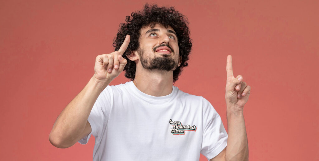
Short answer: 99% of the time, it’s the left chest.
Why? Because that’s the side closest to the heart — and because when people shake hands, their line of sight naturally lands there. It’s comfortable, familiar, and professional without screaming for attention.
Typical placement:
- Around 3–4 inches down from the collar seam
- Centered about 6–8 inches from the edge of the shirt
That’s the “sweet spot” for readability and comfort.
Right Chest: The Alternate Option
The right chest placement is less common but still works well in certain situations. For example:
- When you want to pair your company logo on one side and an employee name or partner logo on the other
- When your brand layout or uniform design calls for asymmetry
Pro tip: if your design includes multiple logos (like sponsor or partner co-branding), right-chest placement can help balance things visually.
Center Chest: Bold and Balanced
If you want your logo to be the star of the show, front and center is the way to go. This placement feels more casual and streetwear-inspired, perfect for event tees, branded merch, or promotional designs.
Best for:
- Large logos or graphic-heavy designs
- Screen prints and digital prints that need space to breathe
Not great for embroidery — stitching a large center design can get stiff or heavy.
Sleeve Prints: Small But Mighty
Sleeve logos are subtle but powerful. They’re great for secondary marks, slogans, or small branding hits.
Common uses:
- Right sleeve for sponsor or sub-brand logos
- Left sleeve for taglines or secondary graphics
- Short sleeves only — don’t fight the cuff seam on long sleeves
This placement adds detail without cluttering the front of the shirt.
Back Prints: Go Big or Go Home
If your front logo is small, balance it out with a full back print. Perfect for event gear, tour tees, or team apparel.
Classic combo: small logo left chest + large back print.
That’s the industry go-to for a reason — clean, clear, and timeless.
Specialty Placements
If you’re feeling creative (and we love that), you can go off-script. Think:
- Hem print: Small, near the bottom edge of the shirt
- Nape of the neck: Great for minimalist branding
- Shoulder print: Eye-catching, especially for sportswear
- Vertical side print: Works for tall, narrow logos or bold statements
These placements give your merch a custom, retail feel — just make sure the design aligns with your brand personality.
Final Word: Placement Is About Balance
At the end of the day, there’s no single “right” spot for every logo — but there is a right spot for every brand.
For professional uniforms, left chest is still the gold standard.
For streetwear or events, front and back center prints make the biggest statement.
And for brands that want to stand out, creative placements can make your merch feel like something you’d actually buy off the rack.
We’ll help you find that balance. Because good merch isn’t just about the logo — it’s about how it wears.